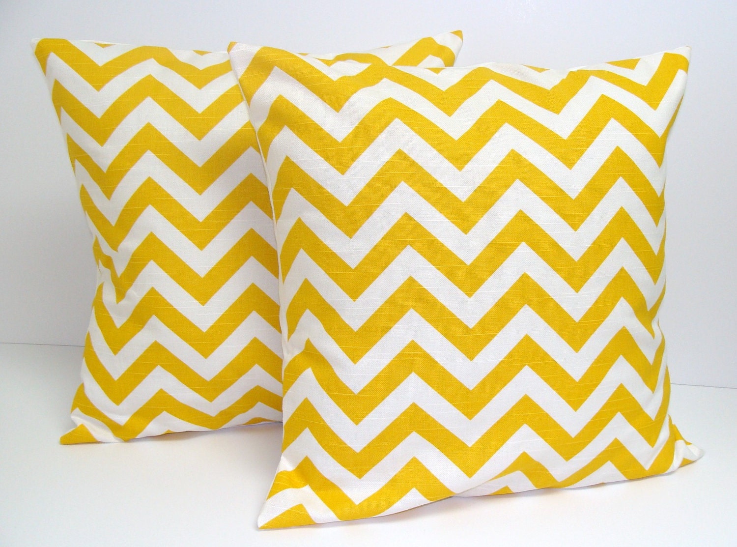
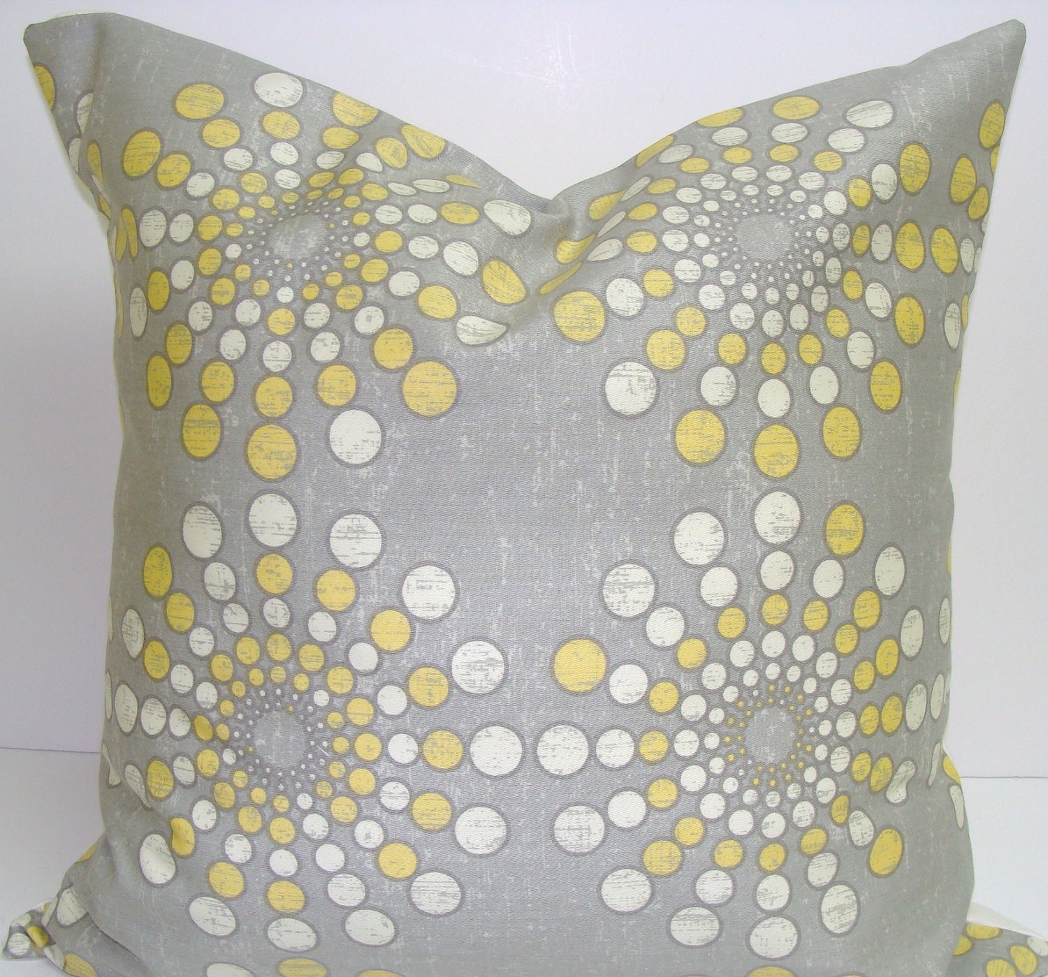
Ello Lovelies :) Apparently... I have been bitten by the design bug. I literally want to redo every room in the house. Now that could get expensive. I guess I can thank Pinterest, HGTV, TLC and Etsy for this little dilemma... not to mention that when I walk into clients houses that are GORGEOUS (like this morning) I get a tad bit jealous...
I somehow managed to talk Jason into a bedroom redo. He really wants dark gray walls, which I'm totally down for because I will be able to rock the gray & yellow color scheme I've been lusting after. And bonus, if I stick with neutral bedding and curtains, I can accessorize with yellow for now, but I can also change colors anytime if I get bored.
Here is what the bedroom looks like now. I like the red, but I think we both have gotten sick of it. At least when we redo- I can use all of the existing bed throw pillows on the couch.
Now here are my inspirations from Pinterest, where else?


share this on:: |
Digg |

/historic/hist_pue_518-6_m.gif)


7 Responses to “Bedroom Design Re-Do!”
OMG I can't watch HGTV anymore because I want to re-do our whole house! I love the wall pattern in the second picture...if we had even one wall that was completely vertical and didn't have windows on it, I would do it in our bedroom.
I am a big fan of the grey and yellow - our bedding is all white with silver/grey accents. Can't wait to see what you come up with!
Also, I have done the hand painted quatrefoil technique in my study and it was a ton of work, but well worth it! I found a great tutorial on a blog!
Check out her version at http://www.landeeseelandeedo.com/2011/03/entry-way-remixx-reposted.html and http://jonesdesigncompany.com/decorate/painted-wallpaper-a-tutorial/ for the original blog.
i love love love the grey and yellow combo! i am moving soon and want to have that color scheme in my living room! love that print and the chevron pillows!
Glad to know I'm not the only one!!
& Holly - thank you for the tutorial, I will totally check it out.
Beautiful post. LOve It! Check my blog new post. If you like follow me on GFC.
www.glamourchocolate.blogspot.com
Would love to see how this turns out, I love the direction you are headed. Just followed you and would love a follow back.
xo,
Lady Grace
www.LadyElizabethGrace.com
@LadyLizGrace
Sam - Just picked you up via your comment on With Love From, Kat (blog).
Also love the grey with yellow and all your choices for pattern detail.
Your photo shows how an extreme color change (red to white) which emphasizes the "low" point rather than enhancing the beautiful volume of your room. Please consider bringing your wall color all the way up through your vaulted ceiling.
At the very least - use the same grey one or two shades lighter for your ceiling angles.
Looking forward to following your project!
Cheers!
Post a Comment